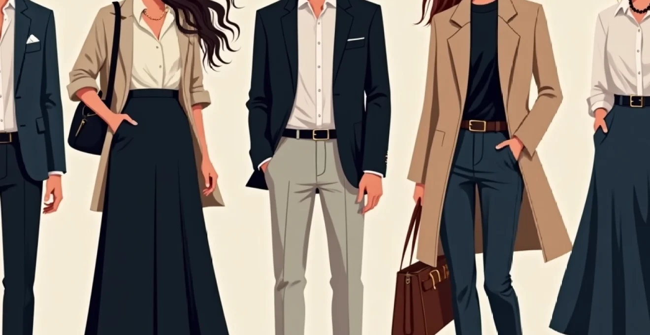
Professional styling extends far beyond simply putting together an outfit—it requires a sophisticated understanding of colour theory, proportion, fabric selection, and accessory coordination. Despite the abundance of fashion advice available today, many individuals continue to make fundamental styling errors that undermine their professional image and personal confidence. These mistakes often stem from a lack of understanding about the technical aspects of dressing well, rather than poor taste or limited resources.
The impact of styling mistakes extends beyond mere aesthetics. Research indicates that first impressions form within seven seconds of meeting someone, with clothing choices accounting for 55% of that initial judgment. Whether you’re navigating corporate boardrooms, attending networking events, or simply wanting to present your best self in daily interactions, mastering the fundamentals of sophisticated styling becomes essential for personal and professional success.
Colour theory violations that sabotage professional wardrobes
Understanding colour theory represents the foundation of sophisticated styling, yet it remains one of the most commonly misunderstood aspects of fashion. Professional wardrobes suffer significantly when colour choices lack intentionality or demonstrate poor understanding of undertones, seasonal palettes, and harmonious combinations. These violations create visual discord that detracts from an otherwise polished appearance.
Monochromatic schemes gone wrong: navy and black combinations
The navy and black combination continues to perplex many professionals, often resulting in outfits that appear muddy or poorly coordinated. This pairing works successfully only when there’s sufficient contrast between the shades—think midnight navy with true black rather than similar-toned variations. The key lies in ensuring one colour dominates while the other serves as an accent, preventing the visual confusion that occurs when both compete for attention.
Professional stylists recommend introducing a third element, such as crisp white or metallic accessories, to bridge the gap between navy and black. This creates intentional contrast and demonstrates purposeful colour coordination rather than accidental pairing. When executed properly, this combination exudes sophisticated restraint perfect for executive environments.
Clashing undertones: Cool-Toned greys with Warm-Toned browns
Undertone clashes represent perhaps the most subtle yet impactful colour theory violation in professional styling. Cool-toned greys paired with warm-toned browns create an unsettling visual tension that signals poor colour coordination skills. This mistake often occurs because both colours appear “neutral” at first glance, leading to assumptions about their compatibility.
The solution involves understanding that greys can lean either cool (blue or purple undertones) or warm (yellow or pink undertones), and these must align with the undertones present in brown accessories or garments. A charcoal grey with blue undertones pairs beautifully with cool-toned taupe, while a greige (grey-beige) harmonises with warm chocolate browns.
Seasonal colour analysis mismatches for deep winter and soft summer types
Seasonal colour analysis provides a scientific approach to identifying which colours enhance natural colouring, yet many professionals ignore these principles entirely. Deep Winter types, characterised by high contrast colouring and cool undertones, often dilute their natural intensity by choosing muted pastels better suited to Soft Summer palettes. Conversely, Soft Summer types may overwhelm their delicate colouring with the bold, saturated hues that flatter Deep Winters.
Understanding your seasonal type eliminates guesswork from colour selection and ensures every garment enhances rather than detracts from your natural beauty. This knowledge proves particularly valuable when building a professional wardrobe, as the right colours convey confidence and attention to detail that colleagues and clients notice subconsciously.
High contrast combinations that create visual discord
While contrast can create striking visual interest, excessive contrast combinations often backfire in professional settings. Pairing stark white with deep black, or bright red with electric blue, creates such strong visual tension that the wearer becomes overwhelmed by their clothing choices. These combinations draw attention to the outfit rather than the individual, undermining professional presence.
Successful contrast requires moderation and intentionality. Consider using the 60-30-10 rule: 60% of the outfit in a dominant neutral, 30% in a complementary colour, and 10% in an accent shade. This approach creates visual interest while maintaining sophisticated restraint appropriate for business environments.
Fit and proportion disasters in contemporary menswear and womenswear
Proper fit remains the most crucial element of polished styling, yet it’s frequently overlooked in favour of trendy silhouettes or discounted pieces. Ill-fitting garments immediately signal poor attention to detail and can make expensive clothing appear cheap. Understanding the technical aspects of fit—from shoulder seam placement to trouser break lengths—separates amateur styling from professional polish.
Shoulder seam placement errors in blazers and structured jackets
Shoulder seam placement represents the most critical fit element in structured garments, as it cannot be altered without extensive reconstruction. When shoulder seams fall beyond the natural shoulder point, they create a droopy, oversized appearance that suggests poor judgment or borrowed clothing. Conversely, seams that pull across the shoulders create unflattering tension lines and restrict movement.
The ideal shoulder seam should align precisely with the natural shoulder point—the bony prominence where the shoulder meets the arm. This placement creates clean lines that enhance posture and suggest confidence. For those with sloped shoulders, slightly extended seams can create the illusion of broader shoulders, while those with naturally broad shoulders benefit from seams that fall exactly at the shoulder point.
Trouser break length mistakes: pudding vs. cropped extremes
Trouser length significantly impacts the perceived quality of an outfit, yet many professionals settle for improper breaks that undermine their polished appearance. Puddling trousers that gather excessively at the ankle create a sloppy, unkempt impression, while overly cropped styles can appear juvenile or inappropriate for conservative business environments.
The ideal trouser length depends on the intended style and formality level. Traditional business trousers should feature a slight break—a small fold of fabric at the front that gently touches the shoe. Contemporary styles may opt for no break, with hems ending just above the shoe, creating clean lines that work particularly well with sleeker silhouettes. The key lies in intentionality rather than accident.
Waistline positioning failures that distort body silhouettes
Waistline positioning dramatically affects body proportions and overall silhouette, yet many individuals choose garments without considering this crucial element. High-waisted pieces can elongate legs and create an hourglass silhouette when worn correctly, but when positioned incorrectly, they can shorten the torso and create unflattering proportions.
Understanding your natural waistline—the narrowest part of your torso—provides the foundation for proper positioning. Garments should either align with this natural waist or create intentional contrast through strategic placement. This knowledge proves particularly valuable for those looking to balance proportions or create specific silhouettes through careful styling choices.
Sleeve length miscalculations in formal and business casual attire
Sleeve length affects the perceived quality and attention to detail in professional attire, yet it’s frequently overlooked during garment selection. Blazer sleeves that extend too far conceal shirt cuffs entirely, while overly short sleeves create an ill-fitting appearance that suggests poor tailoring or inappropriate sizing.
Professional standards dictate that blazer sleeves should reveal approximately half an inch of shirt cuff—enough to demonstrate attention to detail without appearing excessive. This small detail signals sophisticated understanding of menswear principles and suggests meticulous attention to professional presentation. For women’s blazers, sleeves should end at the wrist bone or slightly above, creating clean lines that complement the overall silhouette.
Pattern mixing catastrophes and scale incompatibility issues
Pattern mixing represents one of the most advanced styling techniques, requiring sophisticated understanding of scale, colour coordination, and visual balance. When executed poorly, mixed patterns create chaotic visual noise that overwhelms the wearer and confuses observers. However, when done correctly, pattern mixing demonstrates exceptional style sophistication and creative confidence.
The fundamental principle of successful pattern mixing lies in varying scale while maintaining colour harmony. Combining patterns of similar scale—such as two medium-sized florals or two thin stripes—creates visual competition that lacks hierarchy. Instead, pair a large-scale pattern with a smaller one, ensuring they share at least one common colour to create cohesion.
Geometric patterns generally mix more successfully with organic patterns than with other geometric designs. A structured pinstripe shirt pairs beautifully with a flowing floral scarf because the contrast in pattern types creates intentional juxtaposition. However, mixing multiple geometric patterns requires exceptional skill and often appears better in theory than practice.
The most successful pattern mixing occurs when one pattern dominates while others serve supporting roles, creating visual hierarchy that guides the observer’s eye rather than overwhelming it.
Professional environments typically favour subtle pattern mixing—perhaps a textured blazer with a fine check shirt, or a muted plaid skirt with a delicate printed blouse. These combinations demonstrate style awareness while maintaining appropriate conservatism for business settings. Bold pattern mixing should be reserved for creative industries or casual environments where experimental styling is welcomed rather than discouraged.
Texture mixing offers a safer alternative to pattern mixing while still creating visual interest. Combining different fabric textures—such as smooth wool with textured tweed, or silk with linen—adds depth and sophistication without the complexity of coordinating multiple patterns. This approach proves particularly effective for building professional wardrobes that require versatility and appropriateness across various business contexts.
Fabric selection blunders for different occasions and seasons
Fabric selection significantly impacts both the appearance and appropriateness of professional attire, yet many individuals choose garments based solely on aesthetic appeal rather than practical considerations. Inappropriate fabric choices can undermine the most carefully planned outfits, creating visual inconsistencies or practical challenges that detract from professional presentation.
Seasonal fabric considerations extend beyond simple warmth factors to include drape, breathability, and visual weight. Heavy wools and tweeds appear incongruous during summer months, while lightweight linens lack the substance required for formal winter events. Understanding these nuances prevents the common mistake of wearing seasonally inappropriate fabrics that signal poor judgment or insufficient wardrobe planning.
Occasion-appropriate fabric selection requires understanding the formality level and practical demands of different environments. Business formal settings demand structured fabrics like wool gabardine or wool crepe that maintain their shape throughout long days, while business casual environments allow for more relaxed fabrics like cotton blends or ponte knits that offer comfort without sacrificing professionalism.
Fabric care requirements significantly impact the practicality of professional wardrobes, yet they’re often overlooked during initial selection. Dry-clean-only fabrics can become prohibitively expensive to maintain, while delicate fabrics may not withstand the demands of frequent wear. Balancing aesthetic preferences with practical considerations ensures long-term wardrobe success and cost-effectiveness.
Quality fabric indicators include weight, drape, and finishing details that separate premium garments from budget alternatives. Natural fibres generally offer superior breathability and aging characteristics compared to synthetic alternatives, though modern synthetic blends can provide practical benefits like wrinkle resistance and easy care that prove valuable in demanding professional environments.
Understanding fabric terminology empowers better purchasing decisions and helps avoid common mistakes. Terms like “super 120s” in wool suiting indicate fibre fineness and quality, while understanding weave structures like twill versus plain weave explains durability and appearance characteristics. This knowledge prevents costly mistakes and ensures informed garment selection that meets both aesthetic and practical requirements.
Accessory coordination failures that undermine outfit cohesion
Accessories possess the power to elevate simple outfits to sophisticated ensembles or destroy carefully planned looks through poor coordination. The strategic use of accessories demonstrates advanced styling skills and attention to detail that distinguishes professional presentation from amateur attempts. However, common coordination mistakes frequently undermine these efforts, creating visual discord rather than harmony.
Metal mixing mistakes: rose gold with silver hardware combinations
Metal coordination represents one of the most overlooked aspects of professional styling, yet it significantly impacts overall coherence and polish. Mixing warm-toned rose gold with cool-toned silver creates jarring visual contrast that suggests poor attention to detail or insufficient accessory planning. This mistake occurs frequently because individuals focus on individual pieces rather than considering their collective impact.
Successful metal mixing requires intentional coordination rather than accidental combination. When mixing metals is desired, ensure one metal dominates while others serve as subtle accents. Additionally, choose pieces that intentionally combine multiple metals rather than wearing entirely separate metal-toned accessories. This approach creates purposeful contrast rather than accidental mismatch.
Scale disproportions in statement jewellery and minimalist outfits
Scale relationships between accessories and outfits require careful consideration to achieve balanced proportions. Oversized statement jewellery can overwhelm delicate or minimalist outfits, while tiny accessories may disappear against bold prints or structured silhouettes. Understanding these relationships prevents common mistakes that create visual imbalance or inappropriate emphasis.
The principle of contrast versus harmony applies to accessory scaling decisions. Bold outfits generally benefit from simpler accessories that won’t compete for attention, while simple outfits can support more dramatic accessory choices. This balance creates visual hierarchy that guides observers’ attention appropriately rather than creating confusion or overwhelming the wearer.
Handbag size and silhouette mismatches with body types
Handbag selection significantly impacts overall proportions and silhouette success, yet size and shape considerations are frequently overlooked in favour of trend-driven choices. Oversized bags can overwhelm petite frames, while tiny bags may appear disproportionate on larger figures. Understanding these relationships ensures accessory choices enhance rather than detract from overall appearance.
Body type considerations should guide handbag selection beyond simple size relationships. Angular bags complement structured outfits and geometric body types, while curved bags soften angular features and complement flowing garments. These subtle relationships create visual harmony that enhances overall styling success and demonstrates sophisticated understanding of proportion principles.
Shoe style incongruence with trouser cuts and dress lengths
Footwear selection must coordinate with garment silhouettes to create cohesive looks that demonstrate style competence. Pointed-toe shoes elongate legs and complement slim trouser cuts, while rounded toes provide visual weight that balances wider leg silhouettes. Understanding these relationships prevents common mistakes that create awkward proportions or style inconsistencies.
Dress length coordination with heel height affects leg proportions and overall silhouette success. Midi-length dresses often require heel height consideration to avoid cutting the leg line at unflattering points, while mini and maxi lengths offer more flexibility in footwear choices. These technical considerations separate amateur styling from professional polish and ensure flattering results across different outfit combinations.
Age-inappropriate styling choices across different life stages
Age-appropriate styling represents a delicate balance between remaining current and avoiding trends that lack authenticity or appropriateness for one’s life stage. The most common mistake involves either clinging to outdated styles that no longer flatter or adopting overly youthful trends that appear desperate or inauthentic. Professional styling requires evolving with grace while maintaining personal authenticity and appropriate sophistication levels.
Career progression often demands style evolution that reflects increased responsibility and gravitas. Junior professionals may appropriately experiment with trendier elements, while senior executives typically benefit from more established, classic approaches that convey stability and judgment. This evolution should feel natural rather than forced, incorporating personal preferences within appropriate professional frameworks.
Investment piece selection becomes increasingly important with age, as quality becomes more valued than quantity. Building wardrobes around timeless, well-constructed pieces provides the foundation for sophisticated styling that transcends temporary trends. These pieces should reflect personal style preferences while meeting professional requirements and flattering physical changes that occur naturally over time.
Body changes throughout different life stages require styling adaptations that maintain confidence and appropriateness. Rather than fighting these changes, successful styling works with them, choosing cuts and silhouettes that flatter current proportions rather than attempting to recreate past silhouettes. This approach ensures authenticity and confidence that translates to professional success and personal satisfaction.
Personal style evolution should incorporate lifestyle changes that affect clothing needs and preferences. Active lifestyles may require more versatile pieces that transition between activities, while sedentary careers might prioritise comfort features that weren’t previously important. Understanding these changing needs prevents wardrobe mistakes that prioritise appearance over practical considerations, ensuring long-term styling success and satisfaction.