Color blocking has emerged as one of the most powerful visual techniques in contemporary design, transforming everything from high-street fashion to corporate branding strategies. This sophisticated approach to color application creates striking visual impact through the strategic juxtaposition of solid color masses, offering designers an opportunity to craft memorable and emotionally resonant experiences. The technique’s effectiveness lies in its ability to guide the viewer’s eye, establish visual hierarchy, and communicate brand values through carefully orchestrated color relationships.
While color blocking may appear straightforward on the surface, successful implementation requires a deep understanding of color theory, cultural psychology, and technical execution across various media. Professional designers who master these fundamentals can create compositions that not only capture attention but also drive measurable engagement and conversion rates.
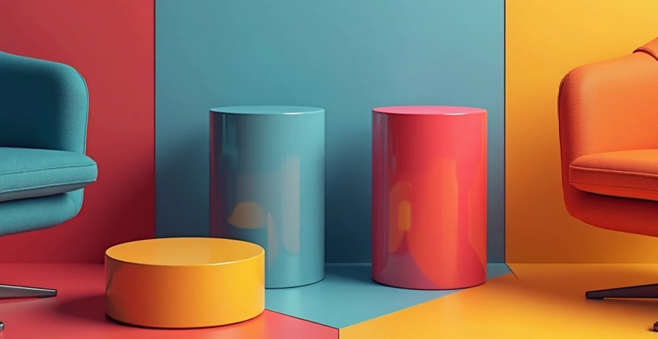
Understanding colour blocking fundamentals in contemporary design
The foundation of effective color blocking rests on a thorough comprehension of how colors interact both visually and psychologically. Contemporary design applications have evolved far beyond the simplistic primary color combinations popularised by modernist movements, embracing sophisticated approaches that consider digital rendering, cultural contexts, and accessibility requirements. Modern color blocking serves multiple functions simultaneously: creating visual interest, establishing brand recognition, and facilitating user navigation through complex information hierarchies.
Professional color blocking requires careful consideration of viewing contexts, from smartphone screens to large-format print applications. The technique’s versatility allows for adaptation across diverse platforms while maintaining visual coherence and brand consistency. Successful color blocking strategies must account for technical limitations such as color gamut restrictions, printing tolerances, and screen calibration variations that can significantly impact the final visual result.
Colour theory principles for effective block compositions
Understanding the fundamental relationships between colors forms the cornerstone of professional color blocking practice. The traditional color wheel provides essential guidance, but contemporary applications require knowledge of advanced color models including HSB (Hue, Saturation, Brightness) and LAB color spaces for precise control over color relationships. Complementary color pairings create maximum contrast and visual tension, making them ideal for attention-grabbing applications such as call-to-action buttons or hero sections.
Triadic color schemes offer balanced visual interest while maintaining harmony across complex compositions. These three-color combinations, positioned equidistantly on the color wheel, provide sufficient contrast for clear differentiation while avoiding the potential harshness of direct complementary pairings. Advanced practitioners often employ split-complementary schemes, which substitute one complementary color with its adjacent neighbors, creating more nuanced and sophisticated visual effects.
Monochromatic versus complementary palette selection strategies
The choice between monochromatic and complementary approaches significantly influences the overall communication effectiveness of color-blocked designs. Monochromatic palettes, utilising various tints, tones, and shades of a single hue, excel at creating cohesive, professional presentations that convey stability and reliability. This approach proves particularly effective for financial services, healthcare applications, and luxury brands seeking to project sophistication and trustworthiness.
Complementary palettes, conversely, generate dynamic visual energy that commands attention and encourages interaction. These high-contrast combinations work exceptionally well for entertainment brands, retail applications, and any context requiring immediate visual impact. The key lies in managing the intensity of these relationships through careful adjustment of saturation levels and proportional distribution across the composition.
Psychological impact of High-Contrast colour combinations
High-contrast color combinations trigger immediate neurological responses that can significantly influence user behavior and emotional states. Research in color psychology demonstrates that certain color pairings activate different areas of the brain associated with attention, memory formation, and decision-making processes. Red and green combinations , for example, create simultaneous contrast effects that can enhance focus but may also induce visual fatigue during extended viewing periods.
The human visual system processes high-contrast color relationships as signals of importance, triggering heightened attention and improved information retention rates of up to 82% compared to monochromatic presentations.
Professional designers must balance the attention-grabbing potential of high-contrast combinations with considerations of user comfort and accessibility. Prolonged exposure to certain color combinations can cause eye strain, headaches, or discomfort, particularly among users with visual sensitivities or color vision deficiencies.
Seasonal colour forecasting integration in block design
Contemporary color blocking strategies increasingly incorporate seasonal color forecasting data to maintain relevance and market appeal throughout annual cycles. Leading forecasting agencies like Pantone and WGSN provide detailed analysis of emerging color trends, consumer preferences, and cultural influences that shape color perception across different demographic segments.
Integrating seasonal forecasting into color blocking strategies requires careful balance between trendy appeal and brand consistency. Successful brands develop core color palettes that remain stable while allowing for seasonal accent colors that can be applied through color blocking techniques. This approach enables fresh visual presentations without compromising established brand recognition or requiring complete redesigns.
Advanced colour blocking techniques for fashion and interior applications
Professional color blocking in fashion and interior design demands sophisticated understanding of three-dimensional space, lighting conditions, and material properties. Unlike flat graphic applications, these disciplines must consider how colors interact under varying illumination, how textures affect color perception, and how human movement influences the viewing experience. Advanced practitioners develop comprehensive color strategies that account for both static and dynamic viewing conditions.
Geometric pattern integration with Mondrian-Inspired layouts
The geometric precision of Mondrian-inspired layouts provides a structured framework for sophisticated color blocking applications. These grid-based compositions rely on mathematical proportions and careful attention to visual weight distribution to create harmonious yet dynamic results. Professional implementation requires understanding of the golden ratio, rule of thirds, and other compositional principles that govern visual balance.
Modern interpretations of Mondrian principles extend beyond simple rectangular divisions to incorporate curved elements, diagonal intersections, and irregular shapes. These variations maintain the essential clarity and boldness of the original approach while offering greater flexibility for contemporary applications. Asymmetrical grid systems can create more dynamic and engaging compositions that better suit modern digital interfaces and responsive design requirements.
Asymmetrical balance methodologies in Multi-Hued compositions
Achieving visual balance in asymmetrical color-blocked compositions requires careful manipulation of color weight, saturation intensity, and spatial distribution. Unlike symmetrical arrangements that rely on mirrored elements for balance, asymmetrical compositions must create equilibrium through strategic placement of contrasting elements. Darker, more saturated colors carry greater visual weight and require smaller areas to balance lighter, less intense hues.
Professional designers utilise the concept of visual leverage, where colors positioned further from the composition’s center require less intensity to achieve balance. This principle enables creation of dynamic, engaging layouts that guide viewer attention through deliberate visual pathways. The technique proves particularly effective in editorial design, web interfaces, and architectural applications where user flow and information hierarchy are critical.
Texture layering techniques within blocked colour schemes
Incorporating textural elements within color-blocked compositions adds depth and visual interest while maintaining the clean, organised aesthetic that defines effective color blocking. Surface textures can dramatically alter color perception, with rough textures appearing darker and matte finishes reducing color intensity compared to glossy surfaces. Professional applications must account for these interactions to achieve intended visual effects.
Layering multiple textures within a single color block creates sophisticated visual depth without compromising the overall simplicity of the composition. Techniques such as subtle pattern overlays, material contrasts, and finish variations enable rich visual experiences while preserving the clarity essential to effective color blocking. This approach proves particularly valuable in luxury retail environments and high-end residential interiors.
Proportional scaling methods for dominant and accent colours
Establishing appropriate proportional relationships between dominant and accent colors requires systematic approach based on mathematical ratios and visual weight calculations. The 60-30-10 rule provides a foundational framework, allocating 60% of the composition to a dominant neutral or primary color, 30% to a secondary color, and 10% to accent colors. However, professional applications often require more nuanced approaches that consider color intensity, viewing distance, and cultural preferences.
Advanced scaling methods incorporate the concept of color temperature balance, where warm and cool colors are distributed to create visual harmony and prevent compositions from appearing unbalanced or uncomfortable. Warm color dominance creates energetic, engaging environments suitable for retail and entertainment applications, while cool color dominance promotes calm, focused atmospheres appropriate for corporate and healthcare settings.
Digital rendering tools: adobe illustrator and procreate workflows
Professional color blocking execution relies heavily on sophisticated digital tools that provide precise control over color values, gradients, and compositional elements. Adobe Illustrator offers vector-based precision essential for scalable color blocking applications, while Procreate provides intuitive touch-based interfaces ideal for exploratory design development.
Effective workflows incorporate color management systems that ensure consistent reproduction across various output devices and media types. Professional designers establish standardised color libraries, document templates, and quality control procedures that maintain consistency throughout complex projects involving multiple team members and delivery formats.
Platform-specific implementation strategies
Each platform presents unique challenges and opportunities for color blocking implementation, requiring tailored approaches that optimise visual impact while respecting technical constraints. Digital platforms must consider screen limitations, loading speeds, and user interaction patterns, while print applications demand attention to ink limitations, paper characteristics, and viewing conditions. Social media platforms each have distinct user behaviors and technical specifications that influence optimal color blocking strategies.
Understanding platform-specific requirements enables designers to create adaptable color blocking systems that maintain effectiveness across multiple touchpoints. This comprehensive approach ensures consistent brand experience while maximising the unique strengths of each platform. Responsive color systems adapt automatically to different screen sizes, orientations, and viewing conditions without losing their essential visual impact.
The rise of dark mode interfaces has introduced additional complexity to color blocking strategies, requiring designers to develop dual-mode color systems that function effectively in both light and dark environments. This challenge has led to innovative approaches using opacity layers, blend modes, and adaptive color algorithms that maintain visual hierarchy and brand recognition regardless of user interface preferences.
Common colour blocking mistakes and professional solutions
Even experienced designers can fall into predictable traps when implementing color blocking strategies, often due to insufficient consideration of technical limitations, cultural factors, or accessibility requirements. Understanding these common pitfalls enables proactive prevention and more successful project outcomes. Professional quality control processes should include systematic review of color relationships, technical specifications, and cross-cultural implications before final implementation.
Oversaturation pitfalls in RGB and CMYK colour spaces
One of the most frequent technical errors in professional color blocking involves oversaturation that cannot be accurately reproduced across different color spaces. RGB color displays can show highly saturated colors that appear dramatically different when converted to CMYK for print production. This discrepancy often results in disappointing final products that fail to match the designer’s original vision or the client’s expectations.
Professional solutions involve early establishment of color limitations based on the final output requirements. Designs intended for print should be developed within CMYK gamut restrictions from the initial concept stage, while digital-only applications can take advantage of the broader RGB color space. Advanced color management workflows utilise soft-proofing techniques that simulate final output conditions during the design development process.
Cultural colour perception issues in global brand applications
Color meanings vary dramatically across different cultures, creating significant challenges for global brand applications. Colors that convey positive associations in one culture may have negative or inappropriate connotations in another, potentially undermining brand effectiveness or causing cultural offense. White color symbolism , for example, represents purity and cleanliness in Western cultures but signifies mourning and death in many Asian cultures.
Cultural colour research reveals that 67% of global brands have encountered negative market reactions due to inappropriate colour choices in specific regional markets, highlighting the critical importance of cultural sensitivity in colour blocking strategies.
Professional solutions require comprehensive cultural research during the design development phase, often involving local cultural consultants or focus groups. Successful global brands develop flexible color systems that allow for regional adaptations while maintaining core brand recognition elements.
Accessibility compliance failures in High-Contrast designs
High-contrast color blocking can inadvertently create accessibility barriers for users with various visual impairments, including color blindness, light sensitivity, and age-related vision changes. WCAG guidelines specify minimum contrast ratios for text readability, but these requirements often conflict with creative color blocking objectives that prioritise visual impact over accessibility compliance.
Professional designers must develop color blocking strategies that achieve both visual effectiveness and accessibility compliance. This often involves creating alternative versions for users with specific needs, implementing adjustable contrast controls, or developing hybrid approaches that meet accessibility requirements without sacrificing visual appeal. Advanced accessibility testing should include evaluation with various assistive technologies and user testing with individuals representing different accessibility needs.
Brand identity dilution through inconsistent palette usage
Inconsistent application of color blocking principles across different brand touchpoints can significantly weaken brand recognition and user trust. This problem often occurs when multiple team members or agencies work on different aspects of a brand without adequate coordination or standardised guidelines. The result is a fragmented brand experience that confuses users and reduces the overall effectiveness of marketing efforts.
Professional solutions involve development of comprehensive brand guidelines that specify exact color values, acceptable combinations, proportional relationships, and application contexts. These guidelines should include both positive examples demonstrating correct usage and negative examples showing what to avoid. Regular brand audits ensure ongoing compliance and identify potential issues before they impact user experience or brand effectiveness.
Measuring success: analytics and performance metrics for Colour-Blocked content
Measuring the effectiveness of color blocking strategies requires sophisticated analytics that go beyond traditional engagement metrics to capture the specific impact of color choices on user behavior and business outcomes. Advanced measurement techniques utilise heat mapping, eye-tracking data, and A/B testing methodologies to quantify how color blocking influences user attention, navigation patterns, and conversion rates. These insights enable data-driven refinements that optimise color blocking performance over time.
Professional measurement frameworks incorporate both quantitative metrics such as click-through rates, dwell time, and conversion percentages, and qualitative feedback gathered through user surveys, focus groups, and usability testing sessions. This comprehensive approach provides complete understanding of how color blocking impacts both user experience and business objectives. Conversion rate optimisation testing specifically focused on color blocking elements often reveals significant opportunities for performance improvement through relatively minor adjustments.
Long-term performance tracking enables identification of seasonal patterns, demographic preferences, and platform-specific behaviors that inform ongoing color blocking strategy development. Successful brands establish systematic review processes that evaluate color blocking performance quarterly, incorporating new data insights, cultural trends, and technological developments that may impact future effectiveness. This iterative approach ensures color blocking strategies remain fresh, relevant, and optimally effective in achieving desired business outcomes.